Illustration Project Update and Materials Used

It feels great to finally be able to give you all an update on my progress with the illustrations I’ve been working on for the first book in a planned series of Corgi fantasy books (middle grade, ages 7-10) by author, K. Kibbee. I spoke more about this project when I made the announcement that I am illustrating a book series.
The past couple of months I have been hard at work creating seven full-page pen and ink illustrations to go inside the book as well as a color cover.
This was the first time I had ever done an exclusively black and white, pen and ink, drawing before. Usually I tend to color them in when they get to the final stages.
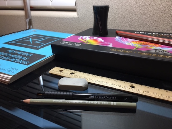
The first thing I did was select my materials (see image above).
I used mixed media drawing paper for the final drafts. It has a nice weight to it and can be used for pen and ink, colored pencils, watercolor, etc. I had my Prang Outline Drawing HB pencil (2260) to use when Light Boxing the rough drafts of each illustration onto their final paper. I talk more about my amazing Light Box here. After the outline was finished, I picked up my Faber Castell size “S” ink pens and got to work! These are waterproof pens that should hold up for mixed media work (I plan to test this out in the future).
Since it was a trial and error process, it took reworking one of the final drafts a couple of times to get the shadows how I wanted them.


At first, they started out way to dark, being solid black. I decided to use a crosshatching technique that I’ve seen done by many pen and ink artists which allows the shadow to have some white areas within it, creating a finished look that is much less harsh than a solid puddle of black under the characters.

Another option for shadows or shading is to do parallel lines close together, which gives an even softer, lighter look to the shadow. It depends on how saturated you want your shadows to be. As you can see, they each have their own advantages and give different textures to the illustration.
In pen and ink illustrations, creating various textures is key in creating the depth and atmosphere you are looking for in order to bring the drawing to life and make it into a polished piece. Without textures, the illustrations can appear flat and unfinished.
So, with these concepts in mind, I got back to work. After getting the approvals for all of the rough drafts from the publishers, I was able to complete the final drafts which each took me a couple of days to complete.
Once those were all finished, I only had the book cover left to do, so it was time to bring out my Prismacolor pencils!

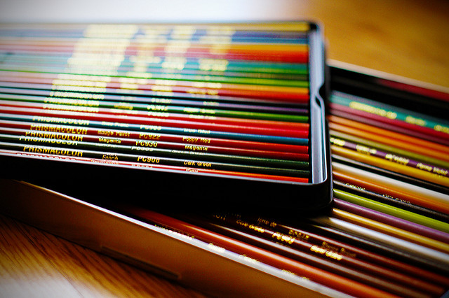
Coloring usually takes me a lot longer to do than black and white. I use Prismacolor pencils and thanks to a present from my husband, I have a wonderful 150 colored pencil set that I use as well as a Prismacolor pencil sharpener (see the image at the top of this post). I found that the standard pencil sharpeners often broke the tips of the pencils off inside the sharpener wasting a lot of the pencil. This is not the case with the Prismacolor pencil sharpener. I can’t recommend Prismacolor enough!
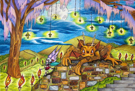
For each area of an illustration I use a series of pencils to get the saturation of color that I am looking for. Usually anywhere from five to eight are used for any given area. You can see what I mean by saturation in the illustration below (not from the Corgi book). I don’t like to see the white paper underneath as much as possible. This technique makes you forget that it’s colored pencils being used in the artwork because the illustrations end up looking more like paintings.

I finished the color cover within a weeks time. Since all of the illustrations were complete, they went to a professional scanning place here in Washington, called J2 Blueprint Supply Co., to produce high resolution images that would end up in the final book. I hope to be able to show you all some of my character sketches and whatnot in the near future, once I get the go-ahead from the publishers.
This project has been an amazing experience and I look forward to illustrating the next books in the series!
What’s up next for me? Well, in the final weeks before my daughter’s arrival (due March 10th), I plan to try to get up a few new videos on my YouTube Channel for my avid amigurumi crocheters out there. Are there any techniques you’d like me to include on the channel that I haven’t already done? Ideas and feedback are always appreciated! I hope you all had a wonderful holiday season. Looking forward to 2017 being a productive year!…
…Though now that my illustration work is done, I feel more like doing this…
